Project 1: Image Search

Featured

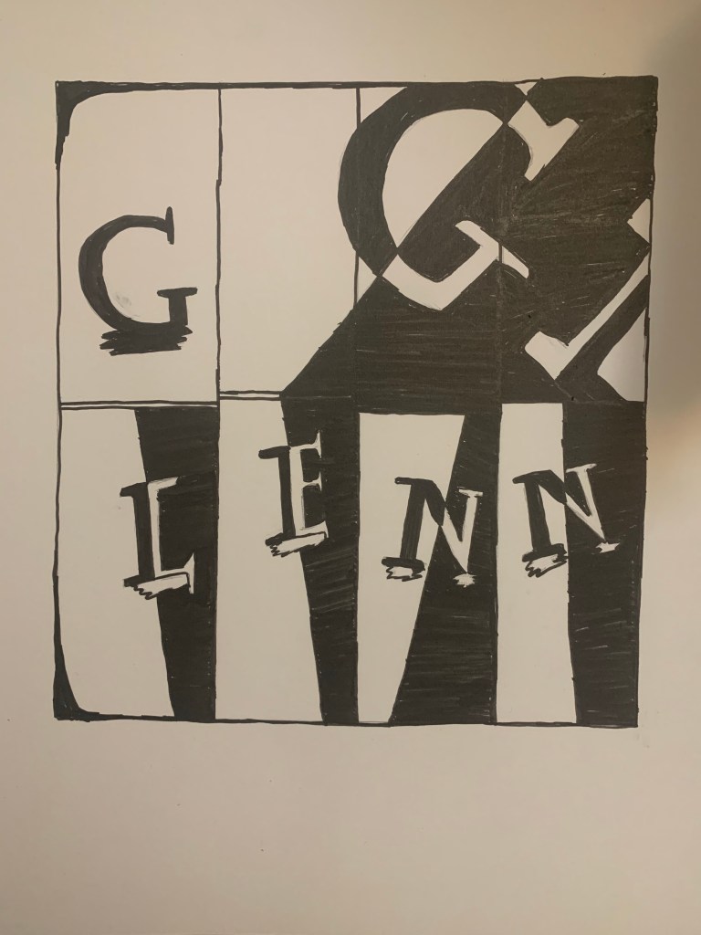
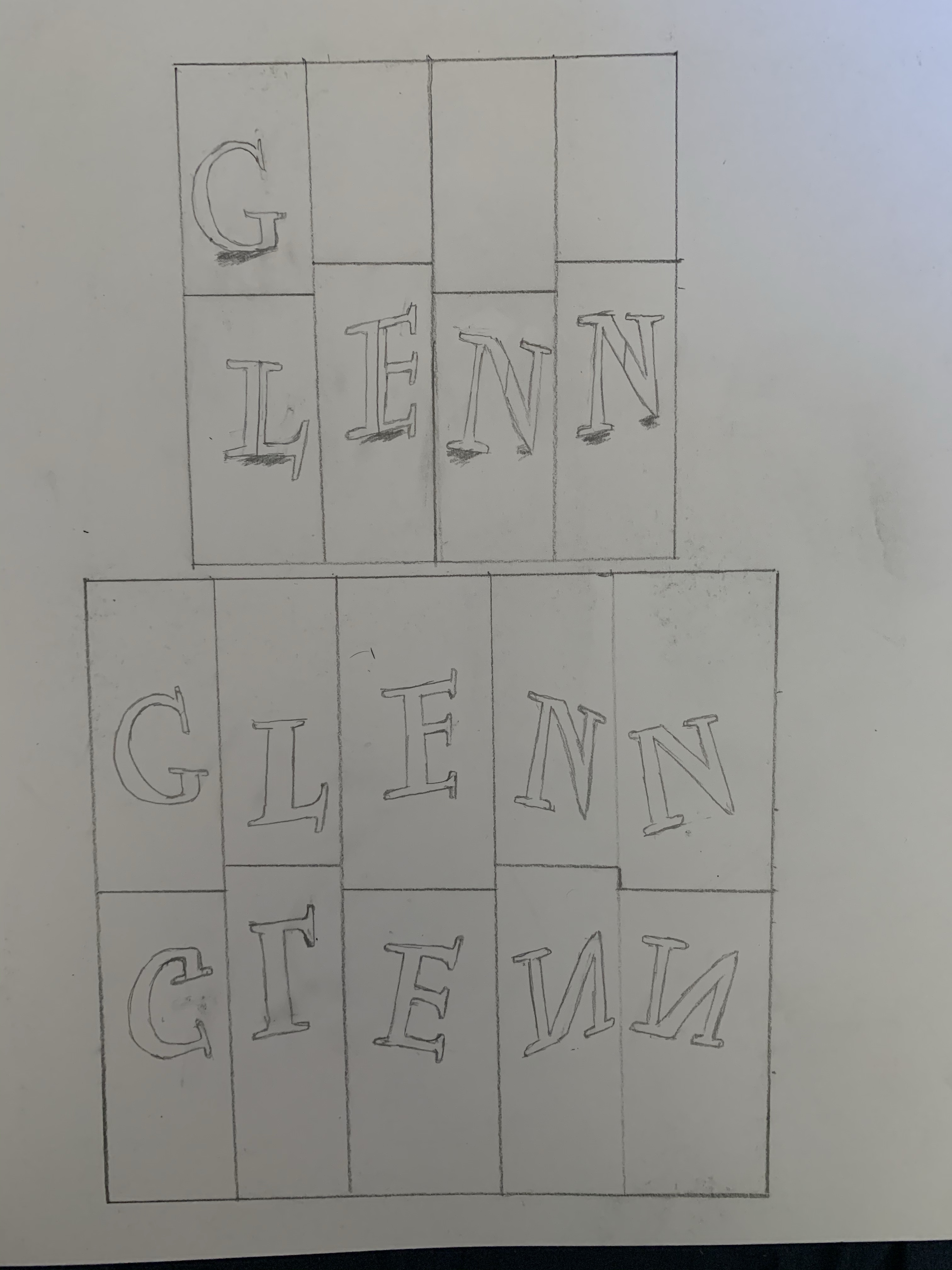
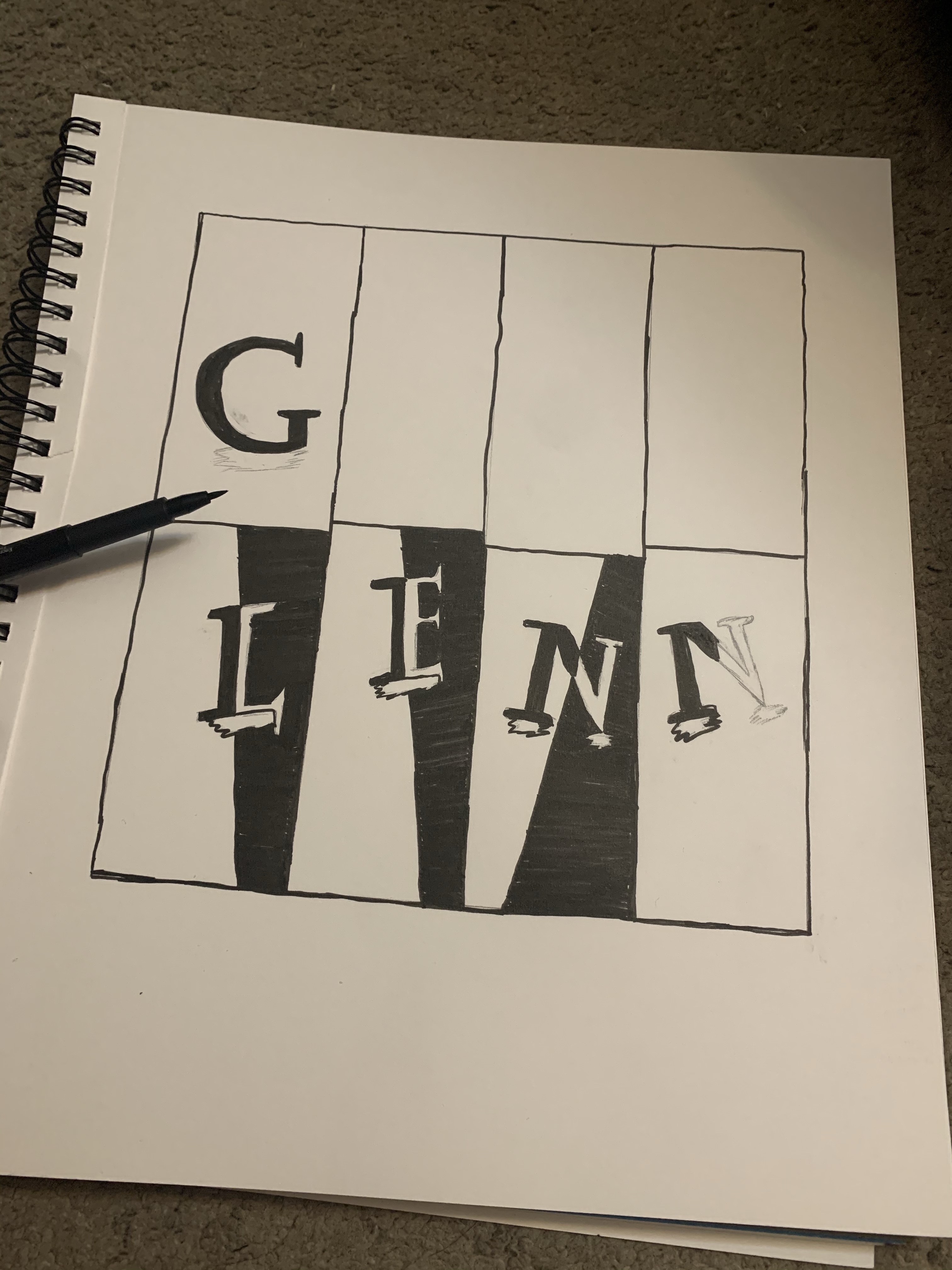
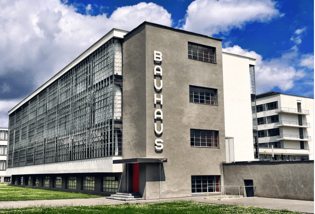
This Bauhaus building caught my eye. I noticed the simple design and minimalism. I love anything that is cut down and made simple that is more of my personal style. This building is also a more modern approach. With one color walls and the glass on the left is very symmetrical. Even the Bauhaus lettering doing downward stands out. I found out that Bauhaus means “construction house” and that Bauhaus artists use linear and geometrical shapes. The doorway caught my eye since it is red while the building has very black and white tones which is a nice touch.

Project 4: Expressive Color Final

Final
Process

For this project, the song I chose was “Out Loud” by Scarypoolparty. Link to Song – https://youtu.be/3BX0rkHSZE4. After listening, I knew what scene I wanted to do. Just from hearing the song at the start, The guitar is a strong focal point in it and super fast so I chose to draw a guitar blown up. I wanted the strings to enlarge and include people walking on it. The feelings throughout the song seem to be happy and energetic. I included people living ordinary life. After that I added a background landscape and chose Light colors that are also complements and seem to vibrate. All done on the Adobe Draw app, I had a blast doing this

Project 4: Expressive Color Final

Final
Process

For this project, the song I chose was “Out Loud” by Scarypoolparty. Link to Song – https://youtu.be/3BX0rkHSZE4. After listening, I knew what scene I wanted to do. Just from hearing the song at the start, The guitar is a strong focal point in it and super fast so I chose to draw a guitar blown up. I wanted the strings to enlarge and include people walking in it. The feelings throughout the song seem to be happy and bright although the message is about saying the truth. So I included people living ordinary life. After that I added a cool background landscape and chose colors that would seem to fit and vibrate. All done on the Adobe Draw app, I had a blast doing this

Project 4 Line w/Color

Here are my 6 Line Shape Drawings with color, coloring really was the fun part by trying to find colors that matched well

Chapter 10: Illusions of Space Summary

Intro

  • Art takes space which can be incorporated to 2-dimensional and 3-dimensional
  • Space gives the illusion can can get rid of flatness
  • Surface and Depth can push a space forward
  • Picture plane – when a canvas is not seen as flat but can be seen as a whole form and plane
  • Foreshortening – when an angle size looks essentially big from distance

Showing Depth

  • Changing and varying size is a tactic to create distance
  • Using Abstract shapes can show space more easier
  • Exaggerating Scale can clearly tell a sense of size and distance
  • Overlap – combing and hiding parts is good for the illusion
  • Vertical Location – spot of how high or low an object is can show ground
  • Aerial Perspective shows distance from how far away things are
  • Plan and Elevation – show placement of objects
  • Perspective helps with giving a visual point for sight
  • Linear Perspective – line to show horizon
  • Vanishing Point – where all lines lead to
  • Monocular – single point
  • One Point Perspective – one easy rhythm that lines follow
  • Two Point Perspective – two lines are used to show background with an angle
  • Multipoint Perspective – technique with multiple parallel lines

Amplified Perspective

  • Special view pointed specifically to viewer
  • Example – Uncle Saw “I want You” pointing to viewer

Multiple Perspective

  • More than one vantage point can be looked at

Axonometric Perspective

  • Using grids and coordinates to form points

Open Form/Closed Form

  • Closed Form – objects placed for our eye to stay within range for center
  • Open Form – objects pointed outward from normal boundaries

Transparency

  • Transparency when nothing is hidden and everything is seen completely
  • Equivocal Space – spacial pattern changes depending on how it is looked

Chapter 13: Color Summary

Intro

  • Color is in everything and a visual perception to the world
  • Additive System – Colors from Lights
  • Subtractive System – Color from pigments
  • Primary Colors – Red, Green, Blue
  • Primary Colors combined equals to white light
  • Complementary(opposites) – create neutral grays
  • Pigments reflect less light

Color Characteristics

  • Color is a product of light and varies depending on time of day
  • Color Constancy – when the mind insists despite evidence
  • Color can change in different surroundings
  • Certain reflections give feedback to color

Properties of Color

  • Hue – name of color
  • Hues can transition into many other colors of the color spectrum
  • Pink, Rose, Scarlet, maroon are classified as the hue red, possibilities are infinite
  • Color Wheel – organization and relationship of colors
  • Primary colors – Red, Yellow, Blue
  • Secondary colors – mix of any two primaries
  • Tertiary – mix of primary and adjacent colors
  • Value – lightness and darkness of a color
  • Intensity(Chroma) – saturation of a color
  • Tint – color added in light/white
  • Shade – color that is darkened/black
  • Mixing with gray or complement color can lower or higher intensity
  • Afterimage – effect given when staring at a color and quickly glancing away
  • Retinal fatigue – Long exposure to one hue can lead to different perceptions

Palettes

  • In a digital color wheel, a hue can be noted differently by degrees
  • There is a letter H for a hue, letter B for light level, and letter S for the saturation
  • (R,G,B) means red, green, blue
  • (C,M,Y,K) means cyan, magenta, yellow and black
  • A painters palette is from minerals with different hues, saturation and mixes

Visual Color Mixing

  • Pigments allow to create new colors
  • Familiarizing the process can lead to different mixed instead of muddy colors
  • Visual Color Mixing/Optical Mixture – two pure colors are being mixed
  • Pointillism/Divisionism – juxtaposed color mixed for different color sensations

Cool/Warm Colors

  • Identified by sense of touch not sight
  • Example – Red/Orange refer to fire so warm, as blue refers to sky/water so cool

Color as Emphasis

  • Color is often planned to direct or show significance
  • From rearranging color contrast, or use of bright and dark colors even shapes and ground color

Color and Balance

  • Having a visual balance in a composition is useful for attracting attention
  • Adjusting Color that fits in a space/environment can create a sense of symmetry in the work

Color Schemes

  • Specific color schemes are called color harmonies
  • Monochromatic Color Scheme – includes one hue
  • Analgous – colors that sit next to each other on color wheel
  • Tonality – dominance of a single color hue
  • Triadic – 3 hues equal distance apart
  • Complementary colors – Opposite colors that complement

Color Discord

  • Colors that do not fit with each other
  • Meant to show unbalance or negative effect but also visually interesting

Color Uses

  • Local color – the identifying color of an object such as banana is yellow
  • With light, color changes
  • Heightened Color – exaggerated and can be used with mood

Emotional Color

  • When color is used that can connect and respond to a feeling or atmosphere

Color Symbolism

  • To associate color with a message or saying

Chapter 12: Value Summary

Intro

  • Value – meaning for light and dark in design
  • Achromatic – when there is no color but only black and white
  • Value Contrast – relationship of light and dark areas

Value Pattern

  • Value pattern – is the arrangement of light and dark and the variations
  • Chiaroscuro – Showing volume in a drawing depending on the light and dark levels
  • With low or high values, the composition can be manipulated

Value as Emphasis

  • Attracting attention is the basis of Emphasis when there is a strong focal point
  • Scattering the contrast levels is good for the viewer

Value and Space

  • Showcasing volume and space is important
  • To reduce flatness, adding 3 dimensional form is important
  • Controlling the lines is useful to show ground from the figure
  • Aerial – sense of coming forward
  • To give off a impression of distance

Technique

  • Shading – adjusting of Value
  • Picking materials and medium
  • cross-hatching – line variations with repetition
  • Mixed Media and Visual Grays

Project 3: Composition

Final Idea For Composition Project

For this project, staring off I sketched my idea of a grid that was 2×4 and 2×5. Designing it to make it look not to complex but Simple. Then as I progressed, I looked into Alternating Rhythm and I knew I wanted bold and white Value where my name is designed. Then My final idea I made a grid, on paper that was a larger scale. The dimensions are 8.5 by 9 inch and I used Faber Castell pens to darken letterings and background.

Chapter 6: Rhythm Summary

Intro

  • Shared connection with Visual and Music Rhythm
  • Kinesthetic empathy – a visual experience that strikes a sense in our mind
  • Different designs such as curves, repetition, when looked at can a create sound in the head similar to real sounds
  • Rhythm is commonly related to sound, but visually it can be a sense of movement and repetition

Rhythm and Motion

  • legato – meaning
  • Shapes and arrangement is key besides colors and lines
  • Constant movement can give a sense of a fast state and use of transitions can be applied
  • Manipulating stokes to create irregular movement can also be used to give off a unique rhythm

Alternating Rhythm

  • When there is a sequence and order to the pattern to know what is expected
  • repeating lines and colors with different and alternating directions help in getting attention

Progressive Rhythm

  • progression of repetition with regular changes
  • Inherent Rhythm – obvious repetition with subtle small progression

Polyrhythmic Structure

  • complex rhythm
  • use of several different rhythm patterns